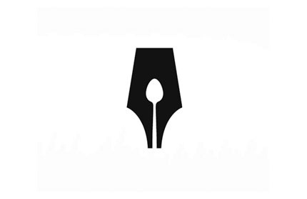
This is an icon I found that is really successful; it uses negative space to show a fork within a fountain pen nib. I'm unsure of the business that it is for, however the use of negative space is something that will be really interesting to focus on.
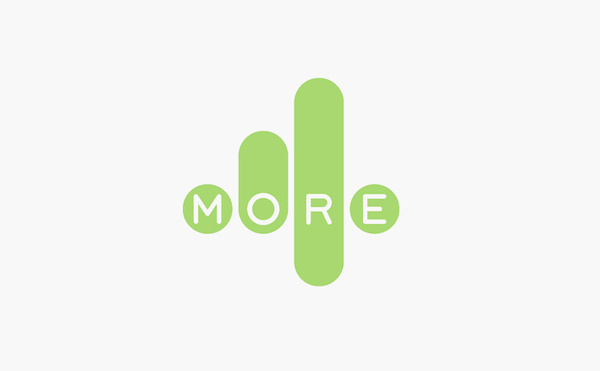
I then looked at the more 4 logo design. It's really successful the way it uses iconography and text together, and it is clear what the logo design is for; the more 4 channel on tv.
No comments:
Post a Comment