Using a random word generator, I generated a word for the first day. The word I have is 'curve'. I think this could be quite a simple word to create a logo design for, as the first letter is curved. This could be played upon and altered to make it stand out. Below is the first attempt at a logo design. I don't think this was very successful because, although readable, it wasn't very legible. It is also very basic, which makes me think it is very possible that it has been created before.
This was the next logo design I created. This is created using a full circle, and then chopping out a part of the circle to make it into a letter 'C'. This is quite successful, however it reminds me a lot of the Beats Headphones logo. I tried to play with this further by adding a kind of gradient to the letterform, however it still looks too similar to the beats logo for me to be happy with the outcome.


I did, however, really like the 'C', so I decided to try to play with the warp tool and make the C look more curved and wavy. The designs directly below weren't very successful as the shape didn't change as I had originally planned. Also, the second reminded me of the shapes I remember from my childhood on CBBC/Cbeebies.


I tried again, however the same still applied; the shape hasn't warped how I wanted it to and it isn't what I pictured.

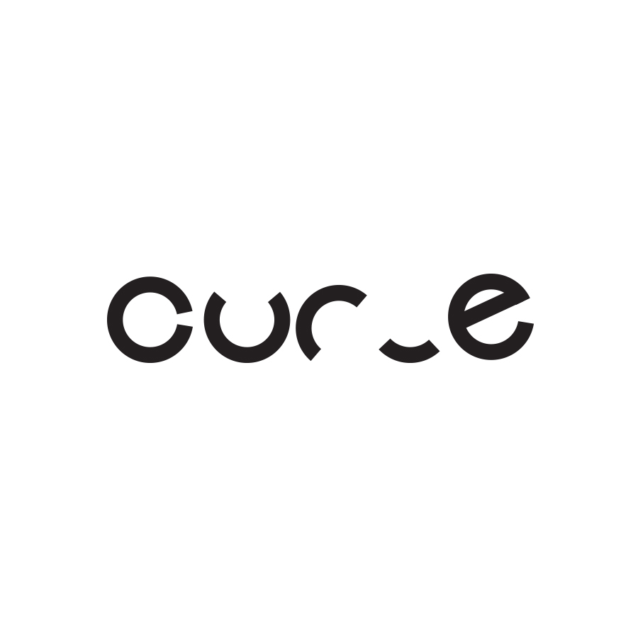
I tried once again, and this is the design I came up with. It's exactly how I imagined it; it's warped enough so that it still looks like a letterform, however it is a lot more curved than the previous attempts. This is the final logo design I created. I think it's successful as it gets across the message of the word, but it's also slick and minimal so therefore in keeping with a successful logo design.

TIME TAKEN: 2hr 31min
No comments:
Post a Comment