Saturday 29 April 2017

OUGD603 Poster Zine - Layout Experimentation - Self-initiated / Research Brief (Brief Seven)

At this point in the project I'm still not sure how I will display the posters, and I have finally finished creating all of the poster designs, so for this reason I am going to make some mock ups of layouts and see which I prefer, and hopefully get some feedback.

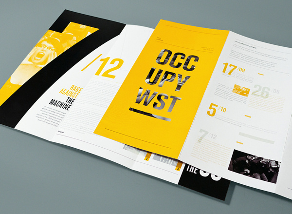
The design below takes inspiration from the People of Print posterzine. It's effective and includes the lyrics of the song, however I don't think there is enough imagery or text to make this successful - and I don't want to include more text as it would never be read. I specifically kept my descriptions of the colour psychology to a minimum for this particular reason. 


Instead, I designed this publication layout below. I think it definitely has potential to be successful, however I'm not really set on the lyric placement. It was very difficult to incorporate both the lyrics and colour psychology description into such a small space.


I also made the above layout using a white background for the type. I think this is a lot more successful as it makes the type more readable and also makes the poster design stand out a lot more.


I then tried a similar layout as the above, however moved the title type and added the specific colours to the text. I don't like this layout as I think the title text doesn't look like it belongs on the page, but I also don't particularly enjoy the colour of the colour psychology descriptions - I think it takes away from the poster design. I also preferred the poster design being on the left so that it is the first thing you see when you turn the page.


I moved the poster back to the left hand side of the spread and centralised the text, taking inspiration from some of the zines I have previously looked at. I think this is definitely on its way to being successful, however I think the type is too big and takes away from the poster design. I want the poster designs to be the main focus of the publication, and then the reasoning to be a secondary focus.


This is the last layout I have come up with. Taking on my own critiques from the previous layout designs, I have made the text a lot smaller and moved it so that the type only begins at the centre of the page. I think this is really successful as the text doesn't take away from the poster design, in fact they compliment each other really effectively.


Before designing the rest of the publication I am going to ask for some feedback to make sure that I'm on the right track.

Thursday 27 April 2017

OUGD603 Chevin Forest - Design Boards - Self-initiated (Brief Nine)


OUGD603 Chevin Forest - Evaluation - Self-initiated (Brief Nine)

This brief was a self-initiated brief that I created when I went to visit Chevin Forest and realised how difficult the map design they have was to follow. I also noted that there weren’t any leaflets to follow and the maps were a great distance from each other, making it really easy to get lost and walk along the wrong trail. I decided to create a map that would be easier to read, and apply it to a leaflet design for this particular reason. 

The concept of my map was to keep it simple and legible; I used contrasting lines to show the main roads and different paths, and cut down a lot of the unnecessary imagery that made the original map very crowded, such as the illustrations of trees. I made sure to use bold colours to make the map design really stand out, however to only use natural colours to ensure that the map design would be in keeping with the aesthetic of Chevin Forest. 

I think my map design is really successful as it is clear that it focused on legibility, and the same concept was applied to the leaflet design. The leaflet design was created with the intention of being a lot smaller than most leaflet designs, meaning that it could be fit into a pocket and was easy to access without the need of extra folding. 

I found this project really challenging as I had never previously designed a map through-out studies, and I didn’t really know where to start, so I looked into a lot of visual research to aid my own development. I really enjoyed this project due to its challenging nature. It looks really effective in my portfolio due to the fact it shows that I can create very functional and informative designs.


My time management of this project was really efficient; unlike other projects, this project was mainly spent designing due to the fact that I had never created a map before, so it took a lot of development to get to the final resolution. 

Saturday 22 April 2017

OUGD603 Chevin Forest - Printing Method - Self-initiated (Brief Nine)

I am going to print the leaflet design using 80gsm white stock. I have decided this as it's a very affordable stock and it means it would be very cost effective to reproduce. 

This was another idea I had of printing; the map would be printed onto a piece of wood and pinned up on trees around the park on the paths. I think this would work really successfully, as it would be recycling old trees, it would really fit with the general aesthetic of the park - there are lots of sculptures around the park created out of old trees. 


OUGD603 Poster Zine - Development: Outro - Self-initiated / Research Brief (Brief Seven)


Outro.


Song Meaning.

“Outro is about a relationship that just won’t seem to work. It’s about all of the heartbreak and the effort put into making it a loving relationship, however time and time again it still ends in disaster. It’s about feeling deflated and tired of its demanding nature, but not giving up.”

Colour Psychology.

Grey is suppressive. It’s a virtual absense of colour, and is therefore depressing and when the world turns to grey we are instinctively conditioned to prepare for hibernation. Grey has a dampening effect on other colours used with it. Heavy use of grey indicates a lack of confidence and fear of exposure.

Red is a powerful colour. It has a physical  effect; it stimulates us and raises the pulse rate, giving the impression that time is passing much faster than it is. It is perceived as demanding and aggressive. 

OUGD603 Poster Zine - Development: Everything - Self-initiated / Research Brief (Brief Seven)


Everything.


Song meaning.

“Everything is a song about falling in love. It’s about the butterfly feeling you get when you think about a person who you are interested in, and how everything that you think about somehow relates back to that one person. ”

Colour Psychology.

Pink is a powerful colour, psychologically. It represents the feminine principles and survival of the species; it is nurturing, soothing and is the colour of love. 

Purple takes awareness to a higher level of thought, even into the realms of spiritual values. It communicates the finest possible quality and has associations with time and space. It’s the colour of truth and vision.

Yellow is the colour of emotion. Yellow will lift our spirits and self-esteem; it’s the colour of confidence and optimism. It’s the colour of emotional strength and creativity.

Blue is the colour of the mind and is soothing. It stimulates clear thought, a calm mind and concentration. It’s the colour of clear communication and trust.  It is often thought of as the colour of reflection and acceptance.

Thursday 20 April 2017

OUGD603 Chevin Forest - Leaflet Development - Self-initiated (Brief Nine)

To begin designing the leaflet, I started by creating a book, however I have realised this is definitely the wrong way to go about it; it doesn't allow much experimentation of layout so I am going to scrap this idea and start again. 


Before designing the leaflet, I thought it would be beneficial to create some quick icons that will go along with the body of text. These can be seen below; I kept each design within a circle as I think it makes the icons look closely related to each other and it's clear they're a set. 


I then created the leaflet below. It's really successful and each element of the leaflet comes together really well, however this was all put onto one side of A4, and therefore there isn't a need to squash the elements together as I have done as the other side would be left blank.


This informed the next design I created. I think this is a lot more successful and each element that makes up the leaflet design has a focus on the negative space around it, and therefore it's pleasing to look at. However, I'm not a huge fan of the positioning of the icons. 


For this reason, I decided to look through some of the photographs I had taken at Chevin Forest and incorporate them into my leaflet design. To make the photographs fit with the design I changed the settings so that the images were mono colours - the colours that was used in the map design. I think this is a really successful outcome as each element works really well together and all of the leaflet's available space is utilised really well. This also allowed me to put the map on the back of the leaflet, meaning the map will be a lot easier to read and follow as it will be bigger, thus answering the brief.


OUGD603 Poster Zine - Development: End of Desire - Self-initiated / Research Brief (Brief Seven)


End of Desire.


Song Meaning.

“End of Desire is a song about persuing a love interest. It’s also about the feeling of being attracted to someone and the idolisation of that person.”

Colour Psychology.

Pink often represents love. It is emotionally balanced and helps spirits soar. It encourages compassion and is creative and imaginative. Pink is non-conformist and can be quite impulsive. 

Red is the colour of lust. It relates to sexuality and can stimulate the appetite of a person. It can increase cravings for stimuli. It is assertive, confident and exciting. Red is often passionate and driven.

Beige is often down to earth. It is wholesome, friendly and stable. It can be reliable and reassuring, however also has the quality of being quietly confident. It represents sensitivity and is often sincere.

Wednesday 19 April 2017

OUGD603 Chevin Forest - Leaflet Research - Self-initiated (Brief Nine)

I have decided to develop this brief further I am going to create a leaflet for the map. This would be really useful at Chevin Park as the maps are spaced very far apart and there are lots of different paths to go down, meaning it's very easy to go the wrong way without instruction.

I found this design below which I think works really well using just two colours - teal and black. This is something I will have to incorporate into my own leaflet design as I have used minimal colours for the design, and therefore it would look very odd if the leaflet used lots of colours.


This is another leaflet design I found whilst looking into leaflets that use a limited colour scheme. It's beautifully designed and uses type in a grid really well. This is something I won't be able to do with my own map design as I have a very small amount of type for my leaflet.


This is the final leaflet design that I looked into. It's very text-heavy, and almost looks like an infographic. I mainly looked at this design to see how they positioned their type; it's in a very postmodern style as type overlaps a lot and there isn't really a theme within the design.


OUGD603 Poster Zine - Development: Crying on the Bathroom Floor - Self-initiated / Research Brief (Brief Seven)

Crying on the Bathroom Floor.


Song Meaning.

“Crying On the Bathroom Floor is about the realization of being in an abusive relationship and the struggle to get away from it. It refers to trauma and how it is sometimes difficult to recognise when abuse has occurred.”

Colour Psychology.

Blue is the colour of depression. It can be emotionally unstable and weak. It is unforgiving and frigid. It indicates unfaithfulness and being untrustworthy. 

Navy is the colour of repressed feelings. It is often hypocritical and pessimistic. It can be compassionate but has trouble showing the emotions that run deep. It often symbolises sadness. 

OUGD603 Poster Zine - Development: Promise - Self-initiated / Research Brief (Brief Seven)


Promise.


Song Meaning.

“Promise is written about misconstruing expressions of passion as authentic expressions of love. It’s about mistaking lust for love. It’s also about struggles with temper within a relationship, and if it’s possible to forgive yourself.”

Colour Psychology.

Pink represents being physically weak, over-emotional and often overly cautious of situations. It often has unrealistic expectations, a lack of will power and lack of self worth. 

Red is the colour of energy and speed. It is often exciting and passionate. It can also represent aggression and a domineering nature. It can be quick tempered and fearful. 

Tuesday 18 April 2017

OUGD603 Chevin Forest - Further Development - Self-initiated (Brief Nine)

Following on from the previous design, I decided to make the map that I had already created into an outline. This makes it more obvious that they are paths and roads, especially when looking at the weight of the strokes. I also think this makes the type stand out even more. 


I then added the details and a key needed for the map to be easily followed. I also added a point on the map where the person would be stood when looking at the map. This is key and something I noticed the original map design was lacking when walking around Chevin Forest Park.


I'm still not completely set on the above colour scheme, so I thought it would be beneficial to strip it back to black and white. I think this is actually really successful without colour. It would also be beneficial as it would save a lot of money on printing, and it would also make it possible to print it out into leaflets so that people could follow it around the whole park. This map, however, makes it very difficult to tell which is a path and white is a river. For this reason, colour will definitely have to be used in the final resolution.


Going on from the previous idea, I added minimal colour to the design to make the key points stand out. I think this is definitely more successful than the previous design as it is clear to see where the rivers are and where the paths and roads are. I also added green text instead of red as I had previously done as I think it makes the design a lot more approachable and friendly, as red generally suggests danger.


OUGD603 Poster Zine - Development: After - Self-initiated / Research Brief (Brief Seven)


After.


Song Meaning.

“After is a song written about waking up the morning after a one night stand. It’s a mixture of feelings of desire, but also regret. It’s about how something feels very different in retrospect than it does in the moment. ”

Colour Psychology.

Purple is the colour of awareness to a higher level of thought. It is spiritual and self-reflective. It is the finest possible quality and has associations with time. It’s the colour of truth and vision. It is often immature and can be arrogant.

Navy is the colour of responsibility. It represses feelings and can be hypocritical. It can be compassionate, however has trouble showing its emotions. It represents knowledge and power. 

Monday 17 April 2017

OUGD603 Chevin Forest - Feedback - Self-initiated (Brief Nine)

I showed the final map design I had come up with to some of my course mates and asked for some feedback. Overall people really liked the design. They said it was minimal, clean, legible and the colour scheme worked really successfully. They asked how I would print it; at this point I'm still unsure and I will decide when the design has been fully completed.

Having given it some time, however, I want to try a different route with the map design as I think it looks very basic and I think I could make it look more slick.

OUGD603 Poster Zine - Development: Around U - Self-initiated / Research Brief (Brief Seven)


Around U.


Song Meaning.

“Around U is a song about a specific place that brings back a memory. It’s a personal feeling that nobody else can feel, however it is also about progressing as a person. The memory no longer affects you in the way that it used to.”

Colour Psychology.

Yellow is the colour of clarity. It relates to thoughts and ideas. It can often help focus and the recollection of information. It can sometimes produce anxiety. It has a tendency to be non-emotional, coming from the head rather than the heart. It depends on itself, preferring not to get emotionally involved.


Orange often represents optimism and enthusiasm. It is self-confident and independent. The colour is adventurous and warm-hearted. It is informal and proud.

OUGD603 Poster Zine - Development: Winterbreak - Self-initiated / Research Brief (Brief Seven)


Winterbreak.


Song Meaning.

“Winterbreak is about a love that you can’t reconcile. You want to make home out of a person that has proved to you time and time again that they are not home; they are just a person. It’s about retracing scars, negative patterns all with the silent belief that moments of communion and understanding might justify months of misfiring and regret. We’re all just trying to get back to that ‘first high’ feeling - an honest endeavour, however futile.”

Colour Psychology.

Green is the colour of possessiveness. It’s envious, devious and inconsiderate. It is over-cautious and bitter at times. 

Yellow often means a judgemental attitude. It’s overly analytical, impatient and impulsive. It represents a pessimistic nature and cowardice. It often lacks compassion and doesn’t show emotion.  


Purple is full of arrogance. It is immature and delusional, and is often impractical. It represents a cynical emotion. 

Saturday 15 April 2017

OUGD603 Chevin Forest - Development - Self-initiated (Brief Nine)

To begin developing my own map design for Chevin Forest, I created the basic outlines of the paths and roads of the map and then added a texture to the background to represent the trees. I think these designs are overly-complicated and are still quite crowded, and would be even more crowded once the type was added.


I then stripped the map back and added a diagonal line to represent the trees instead. This is definitely more successful than the previous developments, however I still think that when the type is added the map will be too crowded.


I completely stripped the map back. I think this is actually really successful on its own, so I am going to add the text.


I decided to add a grey background to the map as this made the text stand out a lot more, but it also made the map a lot less harsh on the eyes. I think this is really successful as it meets the brief; it is a lot more minimal and legible.


I added the important details to the map so that it could be followed a lot easier. This is really successful, however I am going to ask for some feedback before developing this map design further.


Wednesday 12 April 2017

OUGD603 Chevin Forest - Visual Inspiration - Self-initiated (Brief Nine)

Before starting my own map design, I think it will be beneficial to look into maps that already exist. This particular map design below is really beautiful and I love the way it incorporates a photograph into the background. The actual map design is very minimal; it doesn't use any type - this is an element, however, that I definitely need to use in my own map design as the map needs to be legible and usable. 


I then looked at the map below. This is quite similar to the above, however instead of using straight lines it uses curves; this is also really successful - I prefer this particular design because the map isn't created using all of the same thickness of stroke, and therefore it is less harsh on the eyes. This is another map that doesn't use type; I am going to need to find a way to add type into my own design however keep it minimal and uncrowded, this will be quite challenging.


Finally I looked at the map below, focusing on how type is used. i think this is a really interesting way of displaying type; it gives the map a 3D feel. The use of colour is also really intriguing as it is very limited - the only colour is for the type and the rivers, which makes the type really stand out.


OUGD603 Poster Zine - Development: I Know A Place - Self-initiated / Research Brief (Brief Seven)


I Know A Place.


Song Meaning.

“I Know A Place is written for the LGBTQ+ community and how as a collective we are strong and not alone. It is about the importance of LGBTQ+ safe spaces and was released the day after The Supreme Court lifted the ban on same-sex marriages”

Colour Psychology.

Yellow is the colour of enthusiasm. It is confident, optimistic and often represents creativity. It is the colour of communication and networking. It often lift spirits and represents strength.

Pink is a powerful colour, psychologically. It represents the feminine principles and survival of the species; it is nurturing, soothing and is the colour of love. 

Green is a thriving colour. It promotes growth, renewal and restoration. It’s emotionally balanced, practical and down the earth. It is compassionate, kind and encourages social interaction. 

Blue is the colour of the mind and is soothing. It stimulates clear thought, a calm mind and concentration. It’s the colour of clear communication and trust.  It is often thought of as the colour of reflection and acceptance.

OUGD603 Poster Zine - Development: Loudspeaker - Self-initiated / Research Brief (Brief Seven)


Loudspeaker.


Song Meaning.

“Loudspeaker is about how common sexual assault is for women, but also men. It’s an important message to us to bring awareness to as people who talk about sexually assaulting women are becoming president.”

Colour Psychology.

Pink is a powerful colour, psychologically. It represents the feminine principles and survival of the species. It symbolises compassion and understanding. 


Blue is the colour of awareness. It represents responsibility and concern. It also symbolises authority, deceit and can be untrustworthy.

Tuesday 11 April 2017

OUGD603 Chevin Forest - Research - Self-initiated (Brief Nine)

Chevin Forest Park is located in the Wharfe Valley and overlooks the market town of Otley. It consists of a north-facing cliff that rises steeply to a height of 280m above sea level and offers magnificent views of the Wharfe Valley. The whole park was designated as a Local Nature Reserve in 1989 in recognition of its wealth of wildlife including the Green Hairstreak Butterfly and the Woodcock.

Dogs are welcome, but must be kept under control at all times. Dogs are allowed off the lead but only if they are known to return immediately when called.

Location.

Chevin Forest Park is found either side of East Chevin Road, Otley, 10 miles north-west of Leeds city centre.

Attractions and facilities.

- Amazing views from Surprise View car park.
- Cafe at White House.
- Woodland, heathland, and meadowland.
- Rocky outcrops.
- Orienteering routes.

Opening hours.

The White House cafe is at the top of Jonny Lane, LS21 3JL.
Opening hours are:
10am to 2pm, Mon-Fri (excluding Tuesdays)
11am to 3pm, weekends

White House parking is for disabled visitors only.


OUGD603 Chevin Forest - Original Map - Self-initiated (Brief Nine)

Below is the map that is up around Chevin Forest. it's very crammed with illegible text and imagery which is pretty unnecessary. There are some important things on the map that I will include in my own design, however, such as parking and bus stops. The colour scheme of the map is also awful; it's very bright on screen, however in person it is very dull and looks very odd on the wooden noticeboards around the park. 


Monday 10 April 2017

OUGD603 Chevin Forest - Photos at Location - Self-initiated (Brief Nine)

Below are some of the photographs that I took at Chevin Forest Park.  At this point in the project I'm unsure if I will need them, however they are a good thing to have on file just incase. It was quite a grim day so the photographs aren't the best, however with some editing they should be really successful.