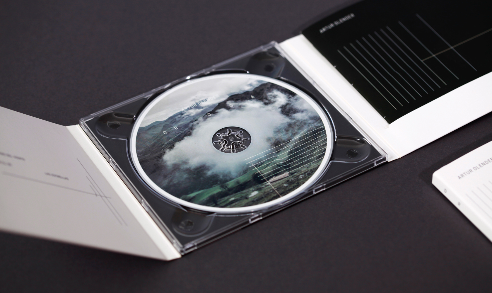
I then decided to look into music-related publications to see if there was a specific layout a lot of them followed. This particular design was a publication for a CD. It is beautifully designed; the focus on negative space and type is clear and works really effectively with the imagery.
I then found this publication below called GLION. It's similar to the above in the sense it has a huge focus on negative space and uses type really effectively, contrasted with strong imagery.
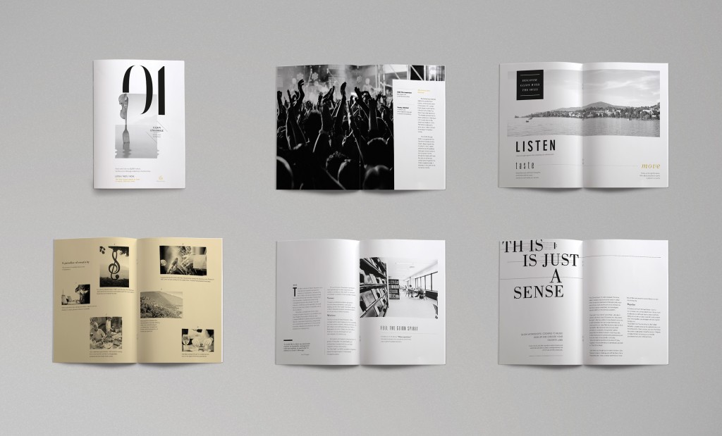 |
| GLION |
I then looked into music-related magazines. This is a double page spread from the magazine Unplugged. It's a postmodern style and uses justified type in a really effective way. It doesn't focus on just one page and works as a spread as a whole.
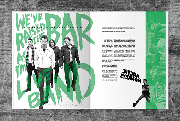 |
| Unplug - The Rock Magazine |
Finally I looked into books about lyrics that already exist. This is a book called The Lyric and is based on Bob Dylan. The layout is nice, however it isn't very engaging - There is a huge focus on the use of columns, and there is a lot of text compared to imagery.
 |
| The Lyric, Bob Dylan |



No comments:
Post a Comment