Thursday 15 December 2016

OUGD603 Plato Cosmetics - Concept Development - Collaboration / Research (Brief Three)

Having undertaken a lot of research into The Lost City of Atlantis, myself and Dan have decided that we will definitely base our project on this particular topic, as it is really interesting and  also a well known story. For this, we decided to create a mind map of possible routes that we could go down with our project, this was a varied range from LGBTQA+ Publications to Campaigns in favour of Britain letting in more refugees.

We have decided, however, to create a brand for a cosmetic company. We thought of this idea, as Atlantis was submerged underwater and that lead us to thinking about bath products. We think this will be a really interesting concept, and can definitely be developed further.

We thought a brand would be the best way for us both to have an equal part in the project, as we can both work on a lot of the things separately, however bring the project together really effectively, for example I will do the branding for the packaging, and Dan will create an illustration for the packaging.


OUGD603 Plato Cosmetics - Research: Plato - Collaboration / Research (Brief Three)


Plato is one of the world's best known and most widely read and studied philosophers. He was the student of Socrates and the teacher of Aristotle, and he wrote in the middle of the fourth century B.C.E. in ancient Greece. Though influenced primarily by Socrates, to the extent that Socrates is usually the main character in many of Plato's writings, he was also influenced by Heraclitus, Parmenides, and the Pythagoreans.
There are varying degrees of controversy over which of Plato's works are authentic, and in what order they were written, due to their antiquity and the manner of their preservation through time. Nonetheless, his earliest works are generally regarded as the most reliable of the ancient sources on Socrates, and the character Socrates that we know through these writings is considered to be one of the greatest of the ancient philosophers.
Plato's middle to later works, including his most famous work, the Republic, are generally regarded as providing Plato's own philosophy, where the main character in effect speaks for Plato himself. These works blend ethics, political philosophy, moral psychology, epistemology, and metaphysics into an interconnected and systematic philosophy. It is most of all from Plato that we get the theory of Forms, according to which the world we know through the senses is only an imitation of the pure, eternal, and unchanging world of the Forms. Plato's works also contain the origins of the familiar complaint that the arts work by inflaming the passions, and are mere illusions. We also are introduced to the ideal of "Platonic love:" Plato saw love as motivated by a longing for the highest Form of beauty—The Beautiful Itself, and love as the motivational power through which the highest of achievements are possible. Because they tended to distract us into accepting less than our highest potentials, however, Plato mistrusted and generally advised against physical expressions of love.

Wednesday 14 December 2016

OUGD603 Helena Wrench Branding - Evaluation - Live Brief (Brief Two)

This brief came about when Helena Wrench got in contact, asking for an identity for her start up business, which is an interior design, painting and decorating company. The aim of the identity was for her to make a memorable, professional impression, however incorporate her style within the logo design. Helena discussed that she would like to leave a lasting impression with her customers so that they would refer her to their friends and colleagues. I decided to take on this brief due to the fact I really enjoy logo design and it’s a live brief. I haven’t created work for a lot of live briefs in the past, especially regarding logo design, so this brief gave an edge to my portfolio that other students might not have. 

My logo design was really successful as it was minimal and informed by Helena’s interior design style. The design is based on her initials, and also a ladder as this is a tool she uses everyday for her company. The business card and invoice design was created in a similar style to be consistent with the logo design. All of the outcomes for the brief were print-based due to the fact that most of Helena’s clientele don’t use emails. 

I really enjoyed this brief as it was a challenge creating a logo design for a live business and I had to come to terms how it would work in the real world; this was successful and Helena is really pleased with the final outcomes as I stuck very closely to her guidelines and needs. 


My time management for the brief was well executed; I believe the brief would’ve taken around two weeks to complete, however due to the fact that COP is due in soon I decided to extend this to four weeks. This gave me a lot of time to perfect the concept for my designs and create really successful designs for print.

Monday 12 December 2016

OUGD603 Helena Wrench Branding - Final Invoice Design - Live Brief (Brief Two)

Having sent the below images to the client, she said she is really happy with the designs and is very grateful, as she is on a very tight budget and couldn't afford to pay a different designer. 


Now all I need to do is print out both the invoice and business cards for Helena and take photographs for my blog.

Sunday 11 December 2016

OUGD603 Helena Wrench Branding - Invoice Development - Live Brief (Brief Two)

Having already got an idea of what the client is after for her invoice designs, this part of the project should be quite simple. She just wants her invoice designs to be minimal, clean and legible. She has also mentioned that the date and invoice number needs to be very clear, preferably in one of the corners of the page so that she can organise them easily. Below are some of the designs I have come up with. The first one is quite successful, however I think the logo design might be a little too big, and it's also missing Helena's contact information and a place to put the clients contact information. 


Below is another invoice mock up. I think this one is a lot more successful than the previous, however there isn't enough negative space due to the coloured block, and it's very text heavy.


From learning this from the previous design, I took that on board and tried to make the design more minimal. Again, I don't think this is very successful. Designing the invoices is definitely a learning curve as each design I create I learn something else. It is clear from this design that the contact names and information needs to be a lot clearer; from this design it isn't clear who is the client and who owns the business.


The next three designs made it clear that there was definitely too much text, and also that it is a lot more legible if the client and business owners name is next to each other and central. It won't be too difficult to refine this idea; I just need to make everything central and get rid of a lot of the text, however still leave room for the client to be precise about what she has done for her customer.


FINAL:

Below are the final invoice designs. I have spoken with Helena and showed her some of the designs, and she said that these are definitely her favourite as they're clear and easy to follow. They also show that she is grateful for the customer and would love to work with them in the future. I originally designed them in black and white to save on printing costs, however Helena has said that she doesn't mind printing them in colour, so for this reason I am going to add colour to the design below.


Below is the invoice design with relevant colours added. Now I just need to get this ready to show to the client and this project will be finished.

Wednesday 7 December 2016

OUGD603 Helena Wrench Branding - Final Business Card - Live Brief (Brief Two)

Below is the final business card design mocked up for the client. She said she's really happy with the design and that it really gets across her interior design style and general aesthetic, and she really likes the colour scheme as it's really colourful yet still tasteful.


The final request from Helena Wrench was to create an invoice for her to give to her clients that fits with the business card and logo design. This will be sent to clients via mail, and therefore doesn't need to work online. 

Tuesday 6 December 2016

OUGD603 Helena Wrench Branding - Business Card Development - Live Brief (Brief Two)

Having received feedback from the client, I am now going to use the logo design for business cards. Business cards are the primary source of the client getting her work, so these need to really represent her brand and be very legible and easy to follow. For this reason, they need to be kept really minimal and clean. Below are some rough mock-ups of possible layouts for the information on the business cards.

I thought this layout could really work as it has a lot of negative space, meaning that it would be possible for Helena to write a quote on the business cards for possible clients, however I don't think it is in the style that Helena would want.


This is another possible layout. This one is a lot more central and therefore matches the design for the front of her business card, so this is a definite possibility.


This design looks even better, as her primary method of contact is through telephone, and this is clear via the layout and bold of the phone number.


I tried to create the business card with her logo design on the back as well as the front, however I think this looks really cramped and there isn't a huge focus on negative space, and therefore doesn't match with Helena's work and general aesthetic.


I tried again with the logo design smaller and at the bottom, however the same applies; it's cramped and isn't pleasing to the eye.


I then played around with using the H from the logo design further, however all of these designs are unsuccessful as there isn't enough negative space and it's not modern as Helena has requested.
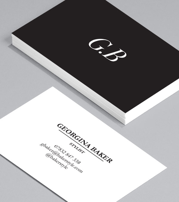


FINAL:

After looking through all the designs, this is the layout that fits best with Helena's request, and it also fits most with the designs that she sent to me as inspiration. The business card looks really slick and well designed, and it gets across the message of minimal and clean design, which matches the clients style of interior design.


Saturday 3 December 2016

OUGD603 Helena Wrench Branding - Client Feedback - Live Brief (Brief Two)

Having sent the logo design and colour scheme over to the client, so now I am just waiting for a response with some feedback.

*EDIT* I have now spoke to Helena Wrench on the phone about the colour scheme and logo design so far, she said that she is really pleased with it and that it definitely captures the essence of her interior design. She said that she really likes the colour scheme as it is colourful and fits well with her aesthetic. She said she pictured something similar, however I have excelled her expectations and she's really pleased.

Having heard this feedback, I am now really excited to start making the collateral for this brief. This shouldn't take too long as I know the style that Helena wants for these, as she has sent me some images of how she wants hers to look. These images can be seen below.

Requests for business card:
- Simple
- Clean
- Room to write specific information on for specific client.


Requests for invoice:
- Easy to follow
- Clean


Wednesday 30 November 2016

OUGD603 Helena Wrench Branding - Colour Theory - Live Brief (Brief Two)

The client has already discussed that she doesn't have a specific colour scheme in mind, so for this reason I have creative control with this specific aspect of the design. She has, however, suggested that the colour scheme be gender neutral to apply to a wider demographic.

Below are some colour mock ups.


It became clear that the above colour schemes were not successful as they used too many colours, and generally lost the effect of the ladder. For this reason, it will be best to keep the logo one specific colour and change the colour of the background. This will be useful for business cards and the general branding of the rest of the collateral as it will keep each consistent with another, and therefore make the brand memorable.


Above are some colour schemes that I have played with now. The colour is in CMYK as the collateral for the client will all be print. This means that the colour scheme will be duller than if it was viewed online, however I think this is successful as it washes out a lot of the colours and they become pastel, which is something the client incorporates in a lot of her interior design.


This is the chosen colour. This was chosen as it is bright, bold and represents the bold colours that the client uses in her interior design. I will confirm this colour with the client before creating business cards and progressing with the collateral of the project further.