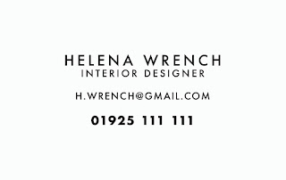
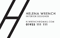
Having received feedback from the client, I am now going to use the logo design for business cards. Business cards are the primary source of the client getting her work, so these need to really represent her brand and be very legible and easy to follow. For this reason, they need to be kept really minimal and clean. Below are some rough mock-ups of possible layouts for the information on the business cards.
I thought this layout could really work as it has a lot of negative space, meaning that it would be possible for Helena to write a quote on the business cards for possible clients, however I don't think it is in the style that Helena would want.
This is another possible layout. This one is a lot more central and therefore matches the design for the front of her business card, so this is a definite possibility.
This design looks even better, as her primary method of contact is through telephone, and this is clear via the layout and bold of the phone number.
I tried to create the business card with her logo design on the back as well as the front, however I think this looks really cramped and there isn't a huge focus on negative space, and therefore doesn't match with Helena's work and general aesthetic.
I tried again with the logo design smaller and at the bottom, however the same applies; it's cramped and isn't pleasing to the eye.
I then played around with using the H from the logo design further, however all of these designs are unsuccessful as there isn't enough negative space and it's not modern as Helena has requested.
FINAL:
After looking through all the designs, this is the layout that fits best with Helena's request, and it also fits most with the designs that she sent to me as inspiration. The business card looks really slick and well designed, and it gets across the message of minimal and clean design, which matches the clients style of interior design.


No comments:
Post a Comment