I have decided to develop this brief further I am going to create a leaflet for the map. This would be really useful at Chevin Park as the maps are spaced very far apart and there are lots of different paths to go down, meaning it's very easy to go the wrong way without instruction.
I found this design below which I think works really well using just two colours - teal and black. This is something I will have to incorporate into my own leaflet design as I have used minimal colours for the design, and therefore it would look very odd if the leaflet used lots of colours.
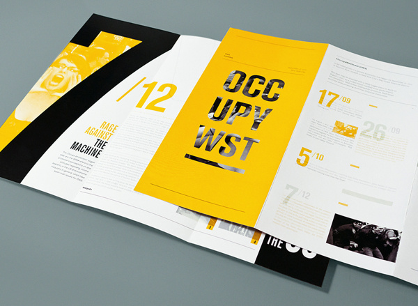
This is another leaflet design I found whilst looking into leaflets that use a limited colour scheme. It's beautifully designed and uses type in a grid really well. This is something I won't be able to do with my own map design as I have a very small amount of type for my leaflet.
This is the final leaflet design that I looked into. It's very text-heavy, and almost looks like an infographic. I mainly looked at this design to see how they positioned their type; it's in a very postmodern style as type overlaps a lot and there isn't really a theme within the design.


No comments:
Post a Comment