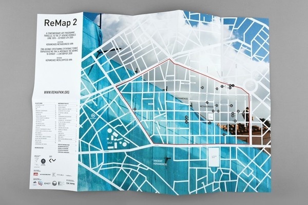
Before starting my own map design, I think it will be beneficial to look into maps that already exist. This particular map design below is really beautiful and I love the way it incorporates a photograph into the background. The actual map design is very minimal; it doesn't use any type - this is an element, however, that I definitely need to use in my own map design as the map needs to be legible and usable.
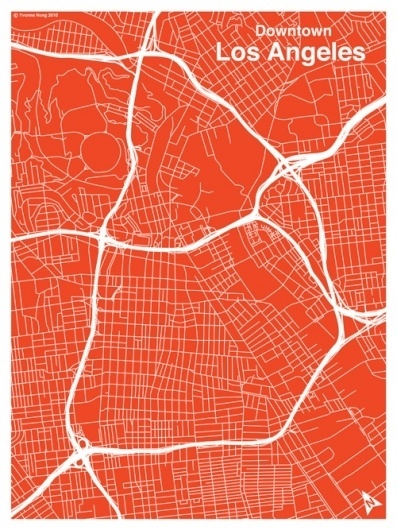
I then looked at the map below. This is quite similar to the above, however instead of using straight lines it uses curves; this is also really successful - I prefer this particular design because the map isn't created using all of the same thickness of stroke, and therefore it is less harsh on the eyes. This is another map that doesn't use type; I am going to need to find a way to add type into my own design however keep it minimal and uncrowded, this will be quite challenging.
Finally I looked at the map below, focusing on how type is used. i think this is a really interesting way of displaying type; it gives the map a 3D feel. The use of colour is also really intriguing as it is very limited - the only colour is for the type and the rivers, which makes the type really stand out.


No comments:
Post a Comment