I then began making layouts for the promotion card. This was quite a difficult task as I'm unsure what the background of the cards will look like as of yet, so I had to guess the positioning. I think this is effective as it's minimal, however it's quite boring to look at - this will probably change when the illustrations are added, however.

I then decided to change the promotion card idea. I decided to create a kind of menu that would be sent along with the subscription boxes, as the promotion card is more for people buying products instead of subscribing, and the initial idea is that people will subscribe and then buy products individually. I made up some products that could go inside the box, all relating to the theme of the brand; vegan, natural and helpful to the environment. This is quite successful, however again it's hard to tell if it will work without the illustrations in the background.

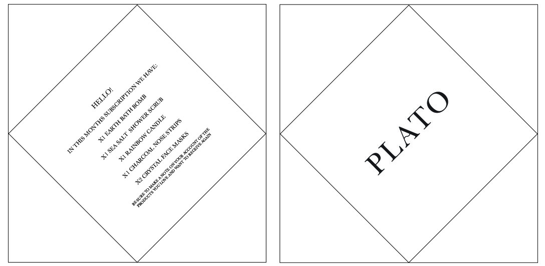
I then created a envelope-styled menu using the folded leaflet I have previously discussed as inspiration. I definitely think that this is the most successful design; it's engaging, interactive and is informed by the concept of the packaging.
I will add the illustrations to the menu once Dan has finished them and sent them to me, and from there I will decide which design is the most successful.
No comments:
Post a Comment