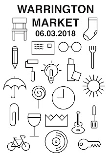
Below is the first poster design I created. I think it's quite successful and would definitely bring in foot traffic to the new market place, however I think the lack of colour will not suit the new refurb of the market. It's also a bit too messy for my liking; the icons are all the same size but they aren't all placed perfectly aligned with each other.
Next I tried to make the icons revolve around the words ' Warrington Market'. I think the type could be made a lot more effective, however I quite like this idea and it could definitely be a successful poster design.
Following on from the previous idea, I thought it might be quite interesting to see the icons within the glasses icon I had created. I think this is really effective and could be made interactive which would definitely bring more excitement to the market and get people more engaged.
I am going to ask for some feedback from some of the class as I can't decide which idea to go with and to add colour to.


No comments:
Post a Comment