
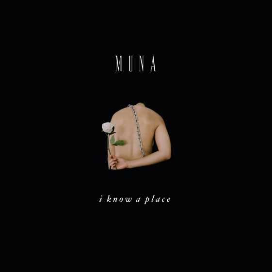
One of their old artworks is very different, however. It uses a white background with bright pink text and uses a mixed media - photography and illustration. This is aesthetically pleasing, however it is very unclear what the artwork is supposed to be and what it is communicating.
Next I started looking at the music video they have for 'If U Love Me Now'. This is part of a really interesting playlist. Around a month ago, MUNA started releasing a lyric video twice a week for each song on their album. They are all part of a series and each tells a message through the imagery. This is really inspiring and definitely useful to figure out the true meaning behind the song, however I am not going to stick to this completely, as each song is up for interpretation and the brief is about what the album means to me, not what it means to them.
As I am creating a poster design, I thought it would be useful to look into some poster designs that I particularly enjoy. This particular design is called 'Yes, of course it hurts'. It's a very modern poster and only features type. This is something I definitely want to experiment with, as I don't have any work that only features type as of yet and I think a poster using type will look really great in my portfolio.

Carrying on from this idea, I looked into more type-based posters. This is another one that stood out to me. Again, it is very modernist however it is beautifully designed and uses opacity of type to hold the viewers interest.

Next I started looking into poster designs that focus on imagery. The poster designs below really stood out to me due to the bold use of colour over black and white imagery. The shape of the block colour is really engaging and guides your eyes around the poster design. I think using bold colours within my own poster design will be really useful, especially as the band is LGBTQ+ and LGBTQ+ are often represented in the community with rainbow flags.

This is a poster design I found for The Courteeners tour. It's a really interesting poster design and uses illustrate and type to engage the viewer. The artwork is really beautiful and is complimented very well with the typeface. I think it will be useful to experiment with illustration rather than photography for my own project as I don't have any relevant images; any that I have are generally iPhone images and therefore not high enough quality.

No comments:
Post a Comment