Saturday, 29 October 2016

OUGD603 10 Briefs Plan

Brief:

Television channels such as ITV and the BBC have recently had rebrands to keep them current. Rebrand a different television channel from the following list:

Dave, Really, Syfy, TLC

To be able to achieve this, you will have to research into the beliefs and demographic of the television channel and also the history of the design within the channel. 

Considerations:

Consider the audience of the channel currently and the demographic.
Consider the future of television and how this could impact the channel - create a solution for this.

Deliverables:

Research into the television channel & television as a whole.
A new logo design.
All blog posts to be posted to Studio Practice blog.

Time Scale:

2-3 weeks.


Brief:

As an extension of the previous brief, create a 10-20 second animation to support the rebranding of the television channel. The objective of the brief is to increase interest, engagement and viewer numbers with the channel. Deliver an experience that gets both viewers and the media interested in the television channel.

Considerations:

Consider the audience of the channel currently and the demographic.
Use mixed media, such as audio and video to communicate your message.

Deliverables:

3-5 storyboards illustrating different ideas.
A 10-20 second sting animation or video.
All blog posts to be posted to Studio Practice blog. 

Time Scale:

4-5 weeks.


Brief:

Research into the do’s and don’t’s on designing for accessibility. Create a piece of graphic design specifically for one of the chosen disabilities, using the guidance from the information you find out. The aim of this project is to show your awareness of the importance of design and the audience.

Considerations:

Consider the audience - who will be viewing your piece of work? Will it be legible? 


Deliverables:

Research into designing for disabled people, and then expand your research for your chosen disability. 
A print, publication or website design aimed at this specific disability.
All blogposts to be posted to Studio Practice blog.

Time Scale:

1 week.


Brief:

Respond to one of the D&AD or YCN Briefs. The importance of this will be to get your name out into the world, and it’s a really great thing to put onto your CV if you are successful. 

Considerations:

Consider how other people would respond - don’t respond in the most obvious way.

Deliverables:

Requirements of D&AD Brief.

Time Scale:

4-5 weeks.


Brief:

Live brief: Contact Independent Leeds/new upcoming store openings and ask if they would let you brand their event/opening. This would be an interesting brief as it would get your design out into the city and have potential to create opportunities for the future.

Considerations:

Consider the stores that already exist around Leeds - the store would need to fit in with Leeds, however it would also need to stand out. 

Deliverables:

Branding / posters / animation / video advertisements etc.
Blog posts on Studio Practice blog.

Time Scale:

3-4 weeks.


Brief:

Recently the giant panda has been downgraded from ‘endangered’ to ‘vulnerable’. This is huge news, however WWF’s logo is of a giant panda. It has had the logo design since 1961 and it is long overdue a revamp and rebrand. Rebrand the logo so that it will be relevant for many years to come.

Considerations:

Consider why the logo is so successful
Who sees the logo?
Who engages with the campaigns?
Look into other logo designs, e.g. The Dodo - what makes this successful?

Deliverables:

A body of research about WWF.
A revamped logo design that is still noticeably for WWF.

Time Scale:


4-5 weeks.

Thursday, 13 October 2016

OUGD603 Creative Networks - Submission - Collaborative / Competition (Brief One)

After finalising the poster designs, we decided it was time to submit them. Below is the email that we sent to the Creative Networks' management. 


We decided that we should include an image showcasing how the background design was created and how it is relevant to that artist. This image can be seen below.

We also included a short summary of the concept which was as follows:

The main components of the poster designs are large distorted sections of work or images representing the selected special speaker. This abstraction makes the poster visually intriguing and exciting, creating a sense of mystery surrounding the event which will hopefully entice audience to find out more.
We wanted to keep things simple, as we see simplicity as being the key to achieving an effective aesthetic and overall tone of voice. The simplicity is achieved through our considered type decisions and compositional treatment.

Wednesday, 12 October 2016

OUGD603 Creative Networks - Final Poster Designs - Collaborative / Competition (Brief One)

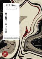
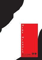
Below are the final poster designs created for Mike Mignola and Amma Asante. They work as a set which is something that, as a group, we really wanted to achieve, but we also wanted to get an element of the speaker across through the use of the background. This was achieved by using the colour schemes of the artists, and also incorporating elements of the speakers work through the distortion - the poster design for Mike Mignola focuses on the background of a lot of his artwork, whereas Amma Asante's poster design focuses on the clear separation of colour, which symbolises the new movie that she has directed, which is about the separation and prejudice of black and white people. 


Tuesday, 11 October 2016

OUGD603 Creative Networks - Label Development - Collaborative / Competition (Brief One)

We then decided we would design a label for the posters. To go along with Izzie's idea of creating a 3D poster, we thought it might be interesting to have the label printed out 3D as it could grab the viewers attention further and add more engagement. The only issue I had personally with this label design was that the Creative Networks logo wasn't included, and therefore it looked very odd when placed on the distorted background. We decided it would be interesting to try printing it out 3D anyway to get an idea of what the poster could look like.


We printed the label design out 3D along with the poster and played around with the placement. As a group, we decided that the 3D aspect of the poster design wasn't necessarily needed as the background design had 3D elements, and therefore it didn't seem to fit as well as we had originally thought that it would. The poster designs definitely caught the viewers attention, however they were very fiddly to put together and the creases in the 3D box made the poster looks quite tacky. This was probably due to the use of stock, however it was very fiddly to put together, meaning it would be whichever the stock choice, and one error would make the poster look this way. 


It was decided that the 3D aspect of the poster design wasn't working, so we all individually went back to the computers and played with the label further. Cameron came up with the idea of keeping the label design more consistent with the poster by including a colour that was used heavily in the background design. We thought this was really successful, however still didn't incorporate the Creative Networks logo and therefore needed some adjustments.


These are the label designs that I created that incorporate the Creative Networks logo design. These were a lot more successful as everything was central and would be placed centrally onto the background design. It flowed a lot more as a poster design and was a lot more legible. The typefaces were chosen to represent the speaker - Mike Mignola creates dark cartoons, so we chose a thick serif typeface as it represents the artist very well. The sans serif typeface was chosen for Amma Asante as a lot of the movie posters that she has directed use sans serif typefaces - similar to Futura. We chose the typefaces that were legible, but also represented the speaker as closely as possible. 


Monday, 10 October 2016

OUGD603 Creative Networks - Background Mock-Ups - Collaborative / Competition (Brief One)

When discussing the poster developments, we decided as a group that it would be good to incorporate some of the colours used by the artist into the background design. To do this, I thought it would be interesting to try to create the background for the posters using the artists actual artwork. Below are the designs for Mike Mignola. As a group, it was decided that these designs were a lot more interesting and engaging to look at as a viewer, and they also stick with Izzie's idea of creating a 3D poster design - as they look a lot less 2D than all of the other poster developments to far. 


I then began creating similar backgrounds for one of the speakers at LIFF30. Below are the poster designs created for Amma Asante. These designs were also a lot more engaging to the viewer, so this style of poster design was decided as a group to be taken forward and developed.


The concept of these poster designs was to create an excitement and intriguing visual which would entice the viewer to find out more about the event. The designs create a mystery and therefore engage with the viewer on a different level than the previous designs. The poster designs for Mike Mignola also follow the idea of using the specific shape he uses in a lot of his backgrounds, as the shape of the distortion follows this pattern.

OUGD603 Creative Networks - Discussion of Individual Posters & Concept Creation - Collaborative / Competition (Brief One)

Myself, Cameron and Izzie all got together and showed each other the poster designs we had come up with so far. Having looked at all of the posters, we thought that the most successful idea so far was Izzie's design. She had created a poster that was 3D (see image below). We weren't all hugely thrilled with the content, but we thought that the idea of using a 3D element to the poster would definitely make it stand out from other submissions. We decided to run with this idea.


We also discussed the fact that we were finding it really difficult to work with the artwork of Mike Mignola, and decided it would be really interesting to see if we could take an element of his work and make that an element of the poster, instead of using his actual artwork. When looking through his work, we realised that the background of most of his artwork is very similar - there's a specific shape behind each figure (see images below).


It would be really interesting to try to recreate a similar shape for our poster design, as it would feature an element of the artists work, but also wouldn't need to feature an actual image of his work. This development can be seen below. The style of these poster mock ups were a lot more successful than all of the other poster developments so far, so as a group it was decided that this style would be taken further and developed more.


Sunday, 9 October 2016

OUGD603 Creative Networks - Mock-Up Poster Designs - Collaborative / Competition (Brief One)

This is the first poster design mocked up. The idea would be to use two sheets of paper, one with the speakers artwork and the other introducing the event. This was unsuccessful as the front sheet of paper looked really empty and there wasn't really a way of getting around that - as you can see below, the type was experimented with heavily.


This is the next poster design. This was definitely more successful than the first design because the type fit a lot more appropriately and it was legible, however the colours used weren't great and the whole poster seemed very 2D and didn't grab the viewers attention.


The next poster design was a lot more successful and played with the type on the image of the speakers work. This would definitely grab the viewers attention, and it also was very legible and easy to follow. The only thing that didn't work was the fact that the poster was quite boring - it grabs the viewers attention, however it doesn't really engage with the viewer - it would be interesting to see if there was a way of making the viewer have to think about what they are looking it further.


This is the final poster design, which was a lot more successful and had a heavy focus on negative space, however there is too much negative space and the poster looks very similar to a lot of posters out there - it's unoriginal and so for that reason it's not successful.

Friday, 7 October 2016

OUGD603 Creative Networks - Primary Research - Collaborative / Competition (Brief One)

It would be beneficial to find out other peoples views of posters, rather than basing the design decisions for my mock up poster designs solely on my own opinions of posters. Below are the questions asked to the participants. Not many people took the survey, however it is clear to see that most of the people that did have very similar views on what makes a poster design a success, which I agree with.

Q1. What catches your eye when looking at poster designs?

A1) When I look at poster designs, the colour is usually the thing that stands out the most - it's the thing that usually catches your eye at a glance, and then the rest of the poster is key to keeping my interest.
A2) Colour, attractive people and shocking images.
A3) Type
A4) Type and colour.

Q2. Do you prefer posters that a) have a lot of type or b) posters that rely on imagery?

A1) b. I think a poster shouldn't hold an insane amount of information, if the person is interested I assume they will go and research the event or what have you further.
A2) Depends how well the type is executed, if it is badly executed it is better to rely on images.
A3) a.
A4) A mix of both a and b. it needs to have the right balance and be aesthetically pleasing.


Q3. Would you take the time to read body copy on a poster?

A1) no, I will only really look at a poster for 10 seconds max at a time - the information should be very visible straight away.
A2) no, not unless i was interested
A3) probably not. it does sometimes look successful though.
A4) no, unless it was a poster online/i was really interested in the event.


Q4. How do you find out about events that you want to attend?

A1) Posters, Facebook, Twitter, Instagram etc. mainly online but posters do help.
A2) online, facebook
A3) posters, Facebook, word of mouth
A4) all of the above ^

Thursday, 6 October 2016

OUGD603 Creative Networks - Initial Ideas - Collaborative / Competition (Brief One)

Before jumping into designing and drawing mock ups of ideas, it will be beneficial to outline the problems that are posed by the brief. Below is a mind map of these initial problems. 


The most important question that came out from creating this mind map was taken directly from the brief and is as follows: 

"How will each event be unique?"

This is the most important problem so far, as each five artists will vary in specialism, however the poster designs must be consistent, irrelevant of specialism or style of artwork. This is one of the most tricky problems to try to solve, as the poster design must be functional with each speaker but also showcase a style or element of their work.

Before discussing with the rest of the group, it will be beneficial to make some very rough mock ups of layout to get an idea of the layouts that could be successful and the layouts that may not be. From creating these mock ups, it is clear to see that the more simplistic designs (the top two designs) will be a lot more successful than the more complex designs (the bottom two designs), as they will be a lot easier to keep consistent over the five poster designs, and also the type and imagery will stand out a lot more due to the use of negative space. It will make the poster a lot easier to follow and hold the viewers attention longer than a design that is complex and needs decoding. 

Wednesday, 5 October 2016

OUGD603 Creative Networks - Research - Collaborative / Competition (Brief One)

Before trying to tackle this brief, it will be helpful to look into previous Creative Networks posters and branding to get an idea of the designs that have been chosen in the past, as this may prompt idea generation and also give a rough idea of the aesthetic that suits within the college. Below are two of the posters that were used as promotion in a previous year. They're effective as the bright use of colours make the posters really stand out, however the use of colour is also kept constant with the speaker - Matt Forsythe has a washed out colour used for the stock on his poster, which fits well with his artwork and use of watercolour, whereas the bold sky blue used for Cameron Stewart is a colour often seen in his work, and is therefore relevant to him. The constant in both posters is the use of the title type - the use of typeface is consistent throughout each poster design and the logo placement is also kept in the same position. This is definitely something to be considered as the poster designs will have to work both individually and as a series.

The most unsuccessful thing about these poster designs is the use of body copy text. Body Copy on a poster isn't common, and it's something that would 9/10 times get overlooked by the viewer, as they are more likely glimpse at the poster than analyse is fully. Posters should have information very clearly organised, so that the most important information can be obtained within seconds.


This is the branding for the talk from Elaine Constantine (from the same year as the above posters). This is key to note, as if the poster designs created are chosen, the rest of the branding for the evenings will need to be designed. It is clear to see that the branding is from the same year of Creative Networks, as the typeface used is the same, and the use of negative space is also sustained. 


Below is another years poster designs for the Creative Networks events. These poster designs are minimal and legible and very easy to follow. The imagery used is very strong and instantly grabs the viewers attention using both colour and the focus of negative space. The logo placement and use of text is also consistent throughout both designs, and the LCA logo is shown using the shape of the imagery - this is very well designed, as it hints to the location of the events - Leeds College of Art. The information included is very concise, however both posters lack quite useful information, such as location of the event, the date and time. The posters also don't mention how to purchase tickets. This is something to be considered within my own groups poster designs.


It may also be helpful to look at other posters around college organising different events, such as SU events. For this reason, I walked around and took some photos of existing poster designs. Below is the first poster that could be relevant for the Creative Networks brief. The use of bold uppercase text really makes the information stand out from other posters, and the uniformed layout makes the poster really legible and flow well. The use of the LCA logo is what stood out mostly, as part of the Creative Networks brief requirements is to include both the Creative Networks logo and the LCA logo, so this is something to definitely consider. The poster is, however, quite dull as it uses very little imagery and looks very much like a certificate, so using imagery is definitely something to consider.


The next poster design is for a Student Union event within the college. The poster uses very bright imagery to catch the attention of the viewer, which is incredibly successful as it stands out from a lot of the posters on this wall in the college. There is very little text on the poster, which is key as all the information about the event is very concise and the attention of the viewer is kept from start to finish. The logo placement on this particular poster is also interesting to note, as it isn't a focus of the poster (unlike the previous). It is still a successful placement of the logo design, however, as the logo is still visible and it is mentioned through the text in the poster that it is a society of the university.


Finally, this poster design is for NEST, the college publication. In my opinion, the poster doesn't stand out at all from the rest of the posters reviewed. This is most likely due to the lack of colour, as this poster blends into the background due to the use of affordable, white stock and the black outlined text. This poster, however, was most likely considered in great detail, as the outlined text and lack of colour means that it was incredibly affordable to print in bulk - which was very apparently done as the poster can be seen on almost every wall in the university. In this sense, it is successful as the poster is hard to avoid. It is also apparent the reason for the lack of imagery - the person wanting submissions doesn't want to influence anyone submitting work and simply wants the work 'Focus' to be the focus of the poster, hence the central positioning of the word and the use of negative space surrounding the word. 


Tuesday, 4 October 2016

OUGD603 Creative Networks - Introduction - Collaborative / Competition (Brief One)

CCE came in to introduce us to this brief. The brief isn't mandatory, however it seems like a really interesting brief to ease myself into Extended Practice with, as it is a short brief (two weeks) and requires two final outcomes, which seems very achievable and means that the final product will be worked on within incredible detail in order to create the best outcome.

Izzie, Cameron and myself have all agreed to team up to try to tackle the brief. Having previously worked with them both prior to this briefing, we are very aware of the group dynamic and how well we all work with each other. Working with Cameron is very interesting, as we are both very different people and our styles are varied, meaning the final outcome usually integrates both styles and is often a design that couldn't be created as individuals. Izzie also brings a lot to the table, as she also has a very specific style and she is very good at coming up with concepts and idea generation.

OUGD603 Creative Networks - Time Management - Collaborative / Competition (Brief One)

As a group, we have decided that we will each go away and individually question the problems of the brief and create initial sketches to ways that this problem could be solved. We will then meet back up and discuss all of our individual ideas and try to come up with more solutions.

Project Plan.

04/10/2016 - 07/10/2016 - Research.
07/10/2016 - 10/10/2016 - Individual poster mock ups.
10/10/2016 - 13/10/2016 - Final resolution & Submission.

OUGD603 Creative Networks - The Brief - Collaborative / Competition (Brief One)

Client: CEE (Careers, Enterprise and Employability) - Leeds College of Art.
Brand: Creative Networks
Date: September 2016
Contact: Andrew Jones andrew.jones@leeds-art.ac.uk (Head of CEE)

Initial test brief to determine finalists:

We want to see your work. Following the brief below, please provide a 1xA3 PDF and/or a moving image file designed for the next guest speakers. One design for Mike Mignola and one for Leeds International Film Festival (LIFF 30) with a guest speaker of your choice. This could be someone you would like to see talk at Creative Networks or someone you have seen speak. Submit to joshua.edgington@leeds-art.ac.uk - DEADLINE 14th October, 5pm.

Project description:
Promotional material for five Creative Network events. Creative Networks in Leeds College of Art's majoy external engagement event where high profile speakers from the creative sectors are invited to share their expertise to an audience consisting of industry, staff and students.

Requirements:
The CEE team are looking for a small team of students (3 to 4) to help promote and design material to be used at each of the five Creative Networks events happening this academic year. Each event is unique based on the guest speakers and flexibility with designs and concepts is key.
The digital materials are needed a month in advance of the event to assist in promotion, whilst printed materials need to be approved by the CEE team as soon as possible and need to be printed a week before each event. See below:

Print:

- A1 Posters (pre-event and on the night decoration)
- 1 x A1 previous speakers poster (list will be provided)
- Signage for guests (choice of size)
- Signage for the night / Vinyl branding (guest speakers name etc.)

Digital:
- GIFs, images to social media dimensions etc. to be used as promotional material for the assistant CEE Manager.

Event Design:
- Predominantly managed by the Assistant CEE Manager, students will be welcomed to suggest ideas and facilitate them if appropriate (work displayed through projectors, light boxes etc.)

Moving Image:
- Played before the guest speaker is introduced as a way to quiet the audience in the lecture theatre. Moving image must include the Creative Networks logo and the name of the guest speaker(s), 15 seconds max and must include sound. The master version will need to be edited for each speaker's name.

Collateral:
- Postcards
- Floor stickers/Vinyl
- (Open to ideas)

Purpose and Benefits:
Creative Networks is Leeds College of Art's major external engage event. The event brings in industry to mix with students and staff as a way to develop connections and also to demonstrate the quality of students work found at Leeds College of Art. Looking forward new ideas will be introduced in ways to develop stronger ties with industry guests attending as a way to benefit students. It is an exciting time to be involved with this series of events and develop some great work for your portfolio and get it seen by guest speakers and a range of industry professionals.

Target Audience:
Staff and students at Leeds College of Art are aware of the events. Our main objective is to bring in professionals from the creative industries. Each guest speaker will appeal to different types of industry and so the work will have to adjust to these needs. A large majority come from Leeds with some who attend repeatedly, but the events are welcome to all from Yorkshire and surrounded cities. The main channels of promotion are print (posters) for within the College and around Leeds, social media and email campaigns are used to contact everyone about the events.

Background:
Creative Networks has been running for a couple of years now and has gone from strength to strength. Creative Networks is our own major professional events programme, and the largest network of its type in the region. It's a fantastic chance to mix with people from industry and to hear fascinating talks from leading speakers in a relaxed environment. Students, former students and staff at Leeds College of Art are all welcome to attend. For a list of previous speakers please look on the Leeds College of Art website under Creative Networks - http://bit.ly/2bT1tDc

Mandatory Requirements:
Leeds College of Art logo and Creative Networks branding must be on all material. A link to the Eventbrite page where tickets can be bought will also be needed.

Timescales:
- Initial test brief deadline - 5pm 14th October
- Winner announced - 18th October
- Design work commences - 18th October