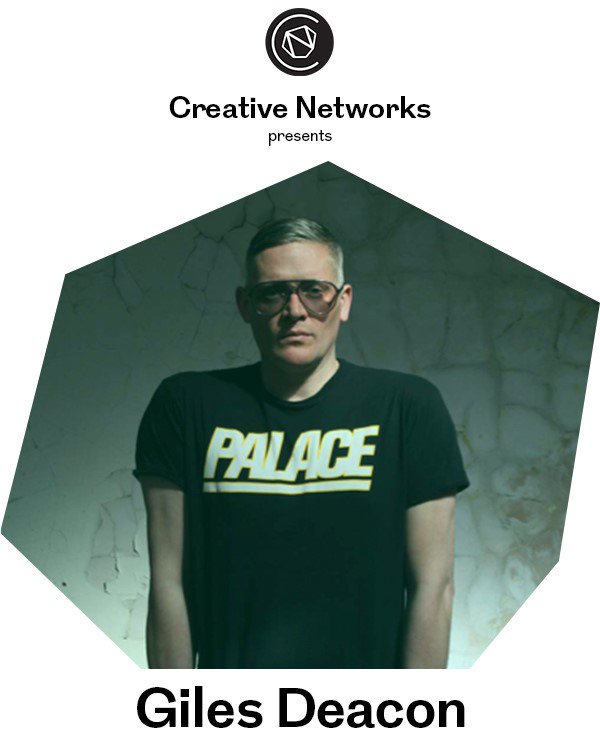
The most unsuccessful thing about these poster designs is the use of body copy text. Body Copy on a poster isn't common, and it's something that would 9/10 times get overlooked by the viewer, as they are more likely glimpse at the poster than analyse is fully. Posters should have information very clearly organised, so that the most important information can be obtained within seconds.
This is the branding for the talk from Elaine Constantine (from the same year as the above posters). This is key to note, as if the poster designs created are chosen, the rest of the branding for the evenings will need to be designed. It is clear to see that the branding is from the same year of Creative Networks, as the typeface used is the same, and the use of negative space is also sustained.
Below is another years poster designs for the Creative Networks events. These poster designs are minimal and legible and very easy to follow. The imagery used is very strong and instantly grabs the viewers attention using both colour and the focus of negative space. The logo placement and use of text is also consistent throughout both designs, and the LCA logo is shown using the shape of the imagery - this is very well designed, as it hints to the location of the events - Leeds College of Art. The information included is very concise, however both posters lack quite useful information, such as location of the event, the date and time. The posters also don't mention how to purchase tickets. This is something to be considered within my own groups poster designs.
It may also be helpful to look at other posters around college organising different events, such as SU events. For this reason, I walked around and took some photos of existing poster designs. Below is the first poster that could be relevant for the Creative Networks brief. The use of bold uppercase text really makes the information stand out from other posters, and the uniformed layout makes the poster really legible and flow well. The use of the LCA logo is what stood out mostly, as part of the Creative Networks brief requirements is to include both the Creative Networks logo and the LCA logo, so this is something to definitely consider. The poster is, however, quite dull as it uses very little imagery and looks very much like a certificate, so using imagery is definitely something to consider.
The next poster design is for a Student Union event within the college. The poster uses very bright imagery to catch the attention of the viewer, which is incredibly successful as it stands out from a lot of the posters on this wall in the college. There is very little text on the poster, which is key as all the information about the event is very concise and the attention of the viewer is kept from start to finish. The logo placement on this particular poster is also interesting to note, as it isn't a focus of the poster (unlike the previous). It is still a successful placement of the logo design, however, as the logo is still visible and it is mentioned through the text in the poster that it is a society of the university.
Finally, this poster design is for NEST, the college publication. In my opinion, the poster doesn't stand out at all from the rest of the posters reviewed. This is most likely due to the lack of colour, as this poster blends into the background due to the use of affordable, white stock and the black outlined text. This poster, however, was most likely considered in great detail, as the outlined text and lack of colour means that it was incredibly affordable to print in bulk - which was very apparently done as the poster can be seen on almost every wall in the university. In this sense, it is successful as the poster is hard to avoid. It is also apparent the reason for the lack of imagery - the person wanting submissions doesn't want to influence anyone submitting work and simply wants the work 'Focus' to be the focus of the poster, hence the central positioning of the word and the use of negative space surrounding the word.


No comments:
Post a Comment