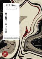
We then decided we would design a label for the posters. To go along with Izzie's idea of creating a 3D poster, we thought it might be interesting to have the label printed out 3D as it could grab the viewers attention further and add more engagement. The only issue I had personally with this label design was that the Creative Networks logo wasn't included, and therefore it looked very odd when placed on the distorted background. We decided it would be interesting to try printing it out 3D anyway to get an idea of what the poster could look like.
We printed the label design out 3D along with the poster and played around with the placement. As a group, we decided that the 3D aspect of the poster design wasn't necessarily needed as the background design had 3D elements, and therefore it didn't seem to fit as well as we had originally thought that it would. The poster designs definitely caught the viewers attention, however they were very fiddly to put together and the creases in the 3D box made the poster looks quite tacky. This was probably due to the use of stock, however it was very fiddly to put together, meaning it would be whichever the stock choice, and one error would make the poster look this way.
It was decided that the 3D aspect of the poster design wasn't working, so we all individually went back to the computers and played with the label further. Cameron came up with the idea of keeping the label design more consistent with the poster by including a colour that was used heavily in the background design. We thought this was really successful, however still didn't incorporate the Creative Networks logo and therefore needed some adjustments.
These are the label designs that I created that incorporate the Creative Networks logo design. These were a lot more successful as everything was central and would be placed centrally onto the background design. It flowed a lot more as a poster design and was a lot more legible. The typefaces were chosen to represent the speaker - Mike Mignola creates dark cartoons, so we chose a thick serif typeface as it represents the artist very well. The sans serif typeface was chosen for Amma Asante as a lot of the movie posters that she has directed use sans serif typefaces - similar to Futura. We chose the typefaces that were legible, but also represented the speaker as closely as possible.


No comments:
Post a Comment